AI Messaging Platform / Priority Controls
Giving marketers a steering wheel for AI agents
An AI messaging platform's agents optimized millions of sends per week but had no concept of business priorities. I designed the control that let marketers steer agent behavior without overriding it: shipped V1, audited its failures across seven dimensions, then redesigned V2 around one insight that changed everything.


The platform's AI agents decided what message each user received, when, and through which channel, optimizing millions of sends per week. They learned from behavior and got smarter over time. But they had no concept of business context. They couldn't tell the difference between a routine Tuesday newsletter and a six-day campaign that the CMO was personally tracking.
A travel brand during holiday season needed to push incentive offers. A fintech during tax filing needed compliance messages to dominate. A sports league needed to boost a campaign that ran for less than a week. All of them had the same problem: no way to say "this matters more right now" without calling the engineering team.
Some details have been generalized to respect confidentiality.
The Gap Was Really a Trust Problem
The platform's agents treated all message outcomes equally. But customers had priorities that shifted constantly, and no native way to express them. The only option was manual intervention by the engineering team, which didn't scale.
By the time the feature was formally pitched, the engineering team had already built bespoke weighting solutions for multiple customers on request. The demand was real and repeating, but the solution was ad hoc.
The deeper issue wasn't workflow inefficiency. It was trust. One enterprise customer's repeated requests for manual overrides, caps, and weighting controls were internally recognized as symptoms of a broader problem. They couldn't let go of the wheel because there was no steering mechanism.
I was the sole designer, working alongside data science, engineering, and customer success. The goal: give marketers a control lever that meaningfully influenced agent behavior without breaking the learning system.
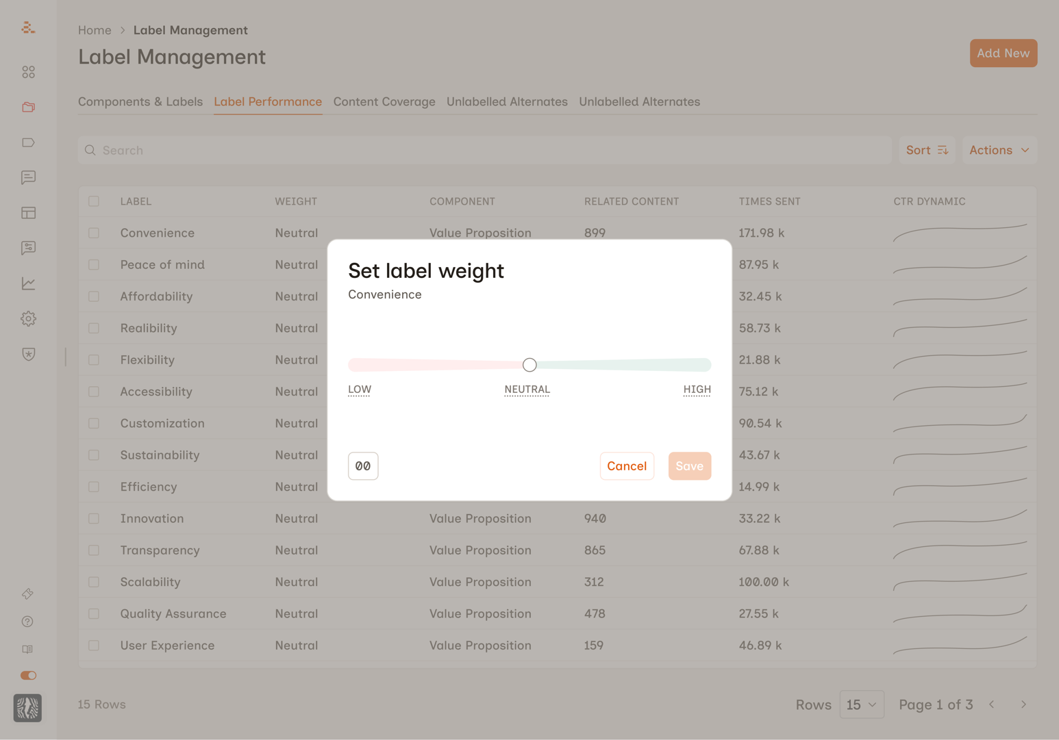
V1: Prove It Works
I designed a modal interface accessible from the label management table. Users clicked a three-dot menu on any label, selected "Edit Relative Strength," and adjusted a slider ranging from Low to High with a numeric value underneath. Intentionally simple. One slider, one modal. Ship it, see what happens.
Changing a label's weight modified the scoring parameters that agents used to select messages. A boosted label got higher scores, making it more likely to win selection. Other labels weren't explicitly suppressed, but because agents pick the highest-scoring option, boosting one makes everything else less competitive. Implicitly zero-sum.
The proof point came fast. One enterprise customer applied aggressive weights and the resulting shift in message distribution was immediate and measurable. The before/after graph was clear enough that the team used it in investor presentations.
The feature became part of a broader trust-rebuilding story with that customer. Agent behavior became more consistent, send diversity improved, and engagement metrics stabilized. Manual overrides dropped as marketers saw agents follow their intent accurately.
V1 worked. But the feature itself had problems.
Seven Things V1 Got Wrong
I audited internal conversations across product, engineering, data science, and customer success teams. The problems were real, and some had already caused damage.
The experience felt inconsequential. This control affects millions of sends per week, but the path to reach it felt like adjusting a minor preference.
The scale was unintuitive. The slider mapped to -100 to +100 internally but was labeled "Low / Neutral / High." Users who dragged below the midpoint suppressed labels without realizing it.
Users couldn't differentiate between values. Customer success teams kept hearing the same questions: "What's a good weight to start with?" No one could explain what any specific number meant.
Zero impact visibility. Users changed weights with no feedback about how many messages were affected or what would happen to sibling labels.
Naming inconsistency. The column said "Weights." The menu said "Relative Strength."
No direct input for power users. Some customers wanted to type exact values rather than drag a slider.
No way to see what had been adjusted. With 50+ labels in a component, there was no quick way to spot which had been changed.
The consequences weren't theoretical. At one customer, a single label at weight 60 caused one message to receive 30,000+ sends while 26 others received under 100 each. At another, months of weight adjustments had no effect because of a backend bug. The UI gave zero indication the settings weren't working.
V2: Designing for the Marketer's Mental Model
Three design principles before touching a screen. Speak the user's language, not the system's. Show the consequence next to the action. Be honest about the system's precision.
The Naming Decision
"Weight" leaks the internal implementation. "Relative Strength" is abstract. Customer-facing teams already used the word "priority" naturally. Renaming to Label Priority wasn't cosmetic. It cascaded into every subsequent design choice. If the feature is called "priority," exact numbers no longer make sense. Priorities are qualitative. That single word unlocked the redesign.
Five Tiers Instead of a Slider
The data science team made the case: users don't say "set this to 57%," they say "make this a priority." Every point on a continuous scale was a decision the user wasn't equipped to make.
Five discrete tiers mapped to natural instructions: Suppress, Reduce, Neutral, Boost, and Maximize. Each maps to a meaningfully different scoring transformation. Fewer tiers wouldn't cover the range. More tiers would recreate the slider problem with words.
Two-Panel Layout
Early iterations stacked everything vertically. Users could adjust priority and miss the consequence entirely. The two-panel layout puts Priority Level on the left and Impact on the right. Cause and effect, always visible.
One Number, Not a Dashboard
I tested distribution bars, stacked charts, daily sends, per-label percentages. All too technical for the target user. I landed on estimated weekly sends: it matched how the platform's analytics worked and how marketers planned campaigns.
Trade-off Language
Boosting one label makes others less competitive. The impact panel communicates this in plain language that escalates with severity. At Boost: "Other labels in this component will see fewer sends to make room." At Maximize: "Other labels may barely send. Use for short-term campaign pushes only." No charts. No percentages. One sentence.
What I Removed
Numeric input, sibling label accordion, distribution charts (all variations), and per-label percentage breakdowns. Each added complexity without earning its place. Marketers think in "more" and "less," not "18% to 43%."
What Happened Next
V2 had moved into implementation when the company was acquired, and the project was deprioritized during the transition. My planned next steps: user testing with 3-5 customers, a table-level filter for adjusted labels, a post-save confirmation state, monitoring integration with a "check back in 48 hours" prompt, and API access for power users who genuinely need exact-value control.
The Lesson
The most impactful design decision in this project was linguistic, not visual. Renaming "Weight" to "Priority" cascaded into every other choice: discrete tiers instead of a slider, plain language instead of percentages, qualitative feedback instead of charts. The engineering team thinks in scoring distributions. The marketer thinks in "make this a priority." The UI's job is to translate between those worlds accurately, but in the user's language.
Want the full picture?
Screens, design iterations, testing sessions, and specific metrics are available on request. I'll walk you through the full process.
Request Walkthrough